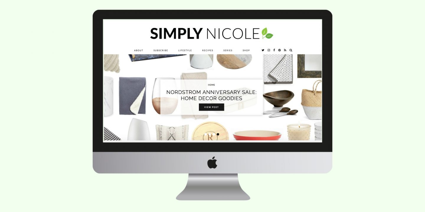
Well hello there. Long time no see. You may have seen that the blog was down for maintenance last week, and if you follow me on Twitter you know that the process took a bit longer than expected. Many of you know that I run Simply Nicole mainly by myself {with occasional help from my husband}. I don’t have a team of full-time coders or designers helping me with day-to-day stuff. If I desperately need their services, I’ll hire them on a project basis. So when I decided that the blog needed a huge makeover, I knew I wanted to at least TRY to do it myself, like I’ve done in years past.
I did a lot of research to figure out what exactly I wanted the blog to look like, features I wanted to add, features I wanted to take away, and so on. I eventually decided to purchase a new theme {aka layout} from a company called Pipdig. I legit can’t say enough good things about them. When I had questions along the way, they were available via email to point me in the right direction and help get my new layout up and running. They aren’t paying me a dime to mention them in this post, and I paid 100% of their fee for a new WordPress theme. I’m mentioning this company because I know many of you are also bloggers and might be looking for a new blog refresh sometime in the near future.
The Makeover Includes:
- A cleaner layout – This makes finding your favorite posts MUCH easier! My favorite part of the layout is the homepage. I love the larger images, full-screen slider, and featured category buttons for wellness, fitness and beauty.
- Goodbye messy sidebar – I’ve been debating going to a one column layout for a while now, and am SO happy that I did. When I did an analysis of the blog, I found that my old sidebar didn’t have my value in it. There was a random photo of me, a search box, my Instagram feed, and some ads. Overall, I felt like it was a waste of space and it needed to go. I got rid of the photo of myself, moved the search box to the top navigation for easy access at any time, and moved my Instagram feed to the footer.
- No more ads – Yep. No more ads. I wasn’t making a ton of money off of ads, so I got rid of them. They were cluttering up my site and were an overall eye sore.
Simply Nicole isn’t 100% finished yet, but I wanted to get it launched today and share my excitement of the refresh with you all. I have a few items that are still in the works but nothing that would affect the overall functionality at this time, which is why I released it a bit early. Here’s what’s still “under construction”…
More Things to Come:
- Newsletter subscription form on homepage – If you’ve been reading for a while, you know that I had a weekly e-newsletter series. I’m bringing it back, and making it even easier for you to subscribe. There’s currently a subscribe page, but I’ll be adding a box right on the homepage so you can enter your email and immediately be signed up.
- FAQ page – I get asked a lot of the same questions on Instagram and Twitter {the camera I use, favorite recipes, my workout routine, go-to blogging essentials, etc.}. I figured that adding an FAQ page would be helpful so you can reference the answers all in one spot.
- Tiny design tweaks – I want to make a few more design updates that you probably won’t notice or care about, but that I need for my sanity. These include page header design, archive and search page design, order of header items in individual posts, and pagination design/functionality.
As always, thanks for continuing to read Simply Nicole! I’m so excited to share this new blog makeover with you, and I hope you love it too.


It looks so great!! I really like the new layout 🙂