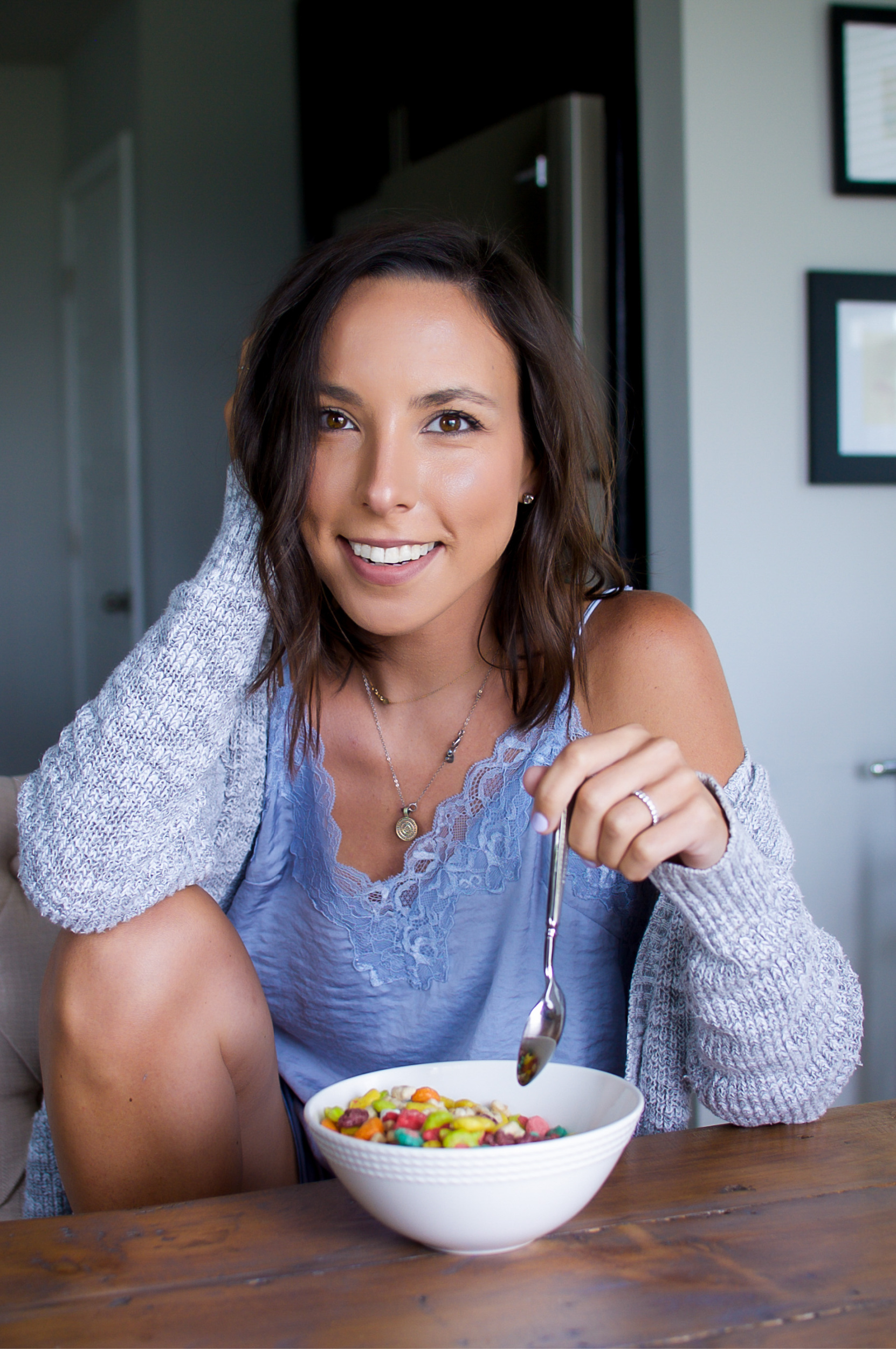
Hey there. Welcome to the new and improved Simply-Nicole.com! I am beyond thrilled to finally share this new site with you all. I’ve been working on it for months and decided today was the day I click publish. I’m freaking out just a little, but am also doing a happy dance.
It’s been a while since I’ve made significant updates to my site and an upgrade was much needed. If you’re viewing this post on mobile, I highly recommend checking it out on desktop too if you can. It’s just as easy to navigate, but there’s some additional features specifically formatted for desktop.
I’ve struggled a lot over the years to refine my brand. If you’ve been a reader for a while, you know that I created my site in 2009 as a healthy living blog where I shared workouts and recipes. I cornered myself into that niche for a long time, and felt weird sharing too much content in other categories like home and motherhood.
I changed and evolved as a person and my site was stagnant. I never truly felt that my website was a good reflection of me. The capabilities and functions of the old site also restricted me creatively. All in all, this new site was designed with you, the reader, in mind.
Branding
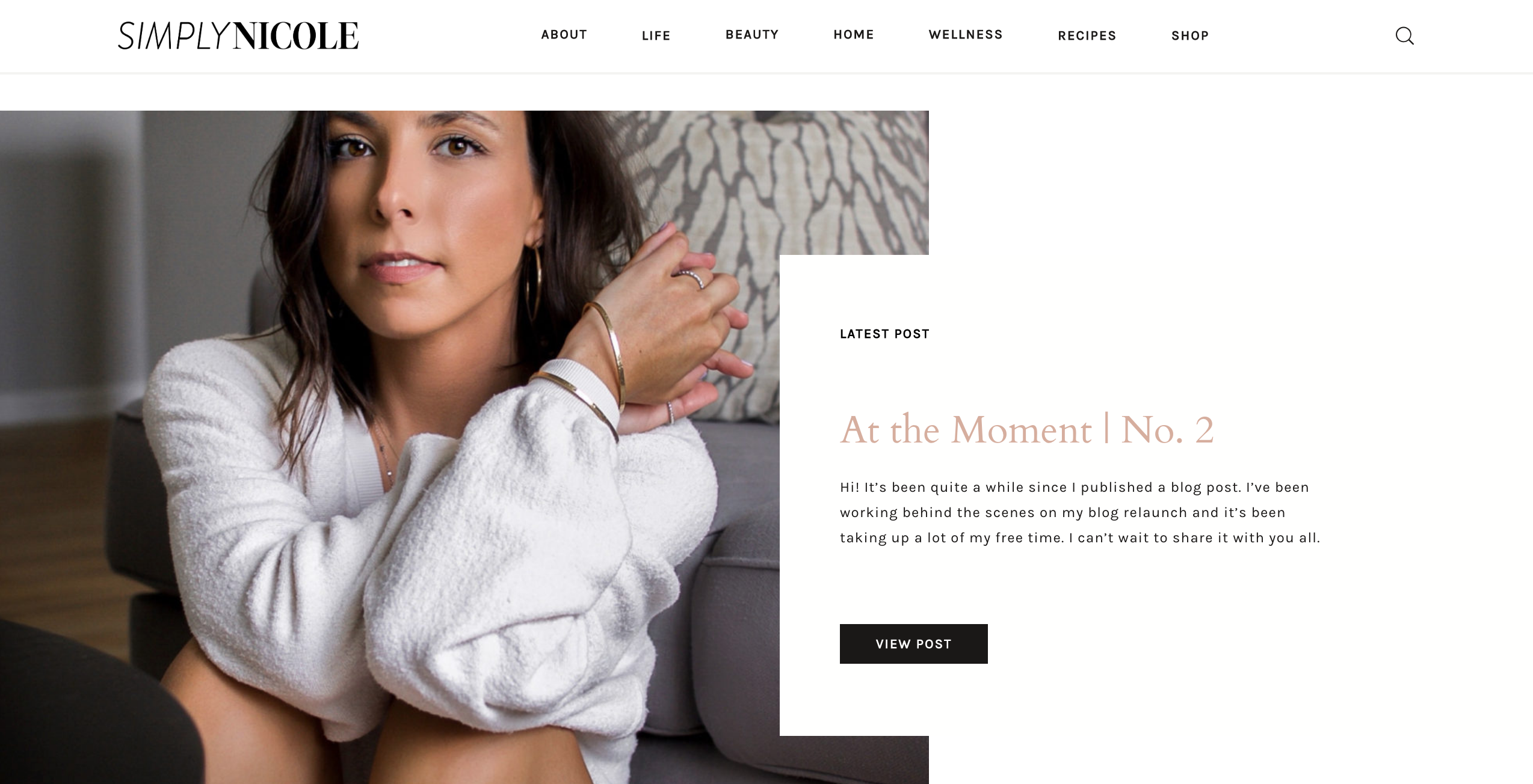
I started thinking about doing a revamp last fall, but quarantine gave me the push I needed to get this massive project underway. First up was new branding, which is the most fun item on my long to-do list. My new logo is modern and clean like my previous one. It has a mix of serif and sans serif fonts, which gives me some flexibility to use either throughout the site. In terms of color, I wanted to keep it mainly black and white as before, but the bright green accent color and small leaf icon had to go. Instead I swapped it for a blush peach color. It’s softer and pulls away from the healthy living genre.
Shopping Experience
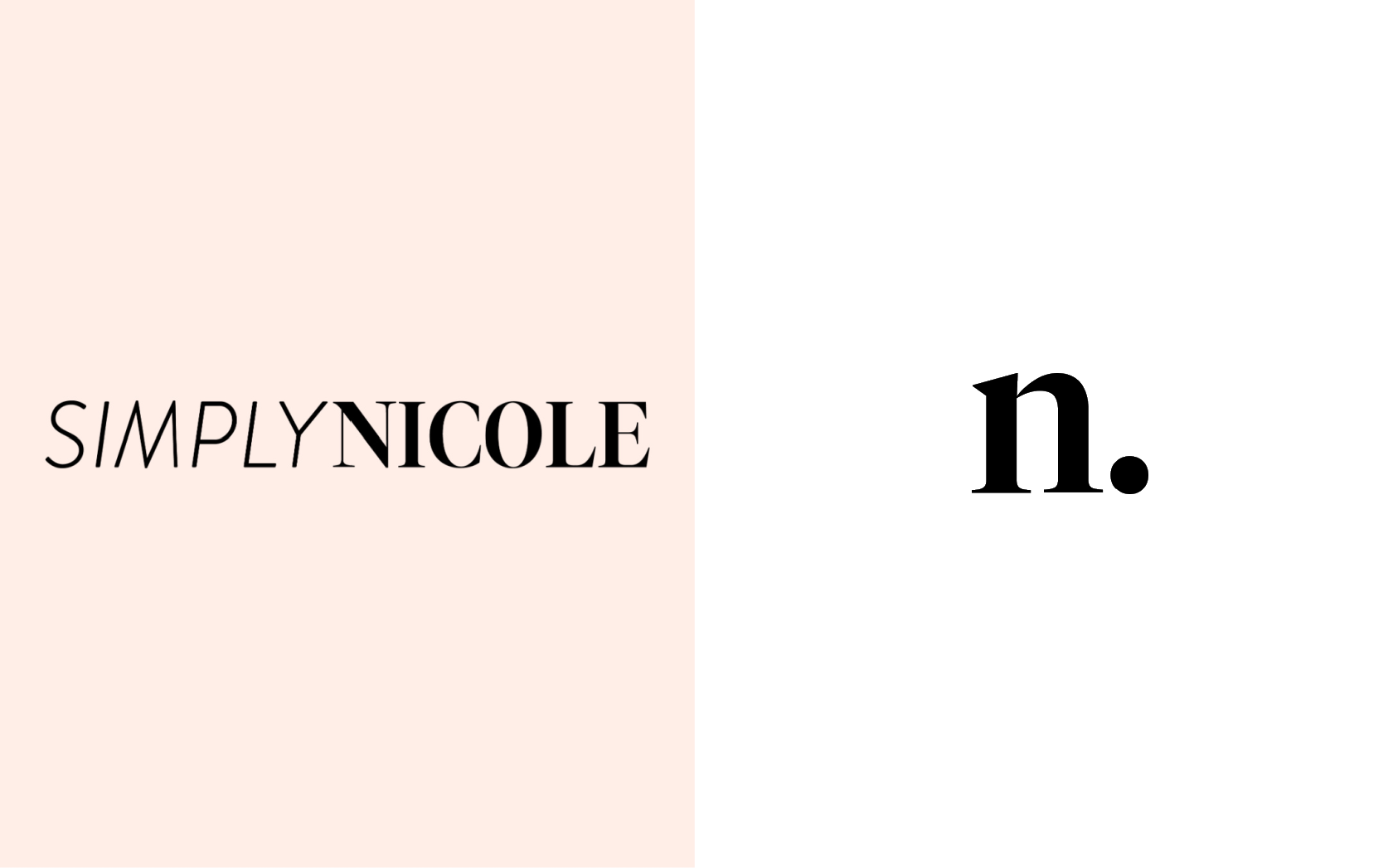
One of the newest features is an easier way to shop. Most of the DMs I receive are questions about where to find something I shared on Stories. Since I don’t have the “swipe up” capability, I needed to tailor my site to allow for easier shopping and browsing.
The Shop page is a place to quickly find items I’ve likely mentioned on Stories. Right now, there’s a few different shops: beauty, children, home, fashion, and wellness.
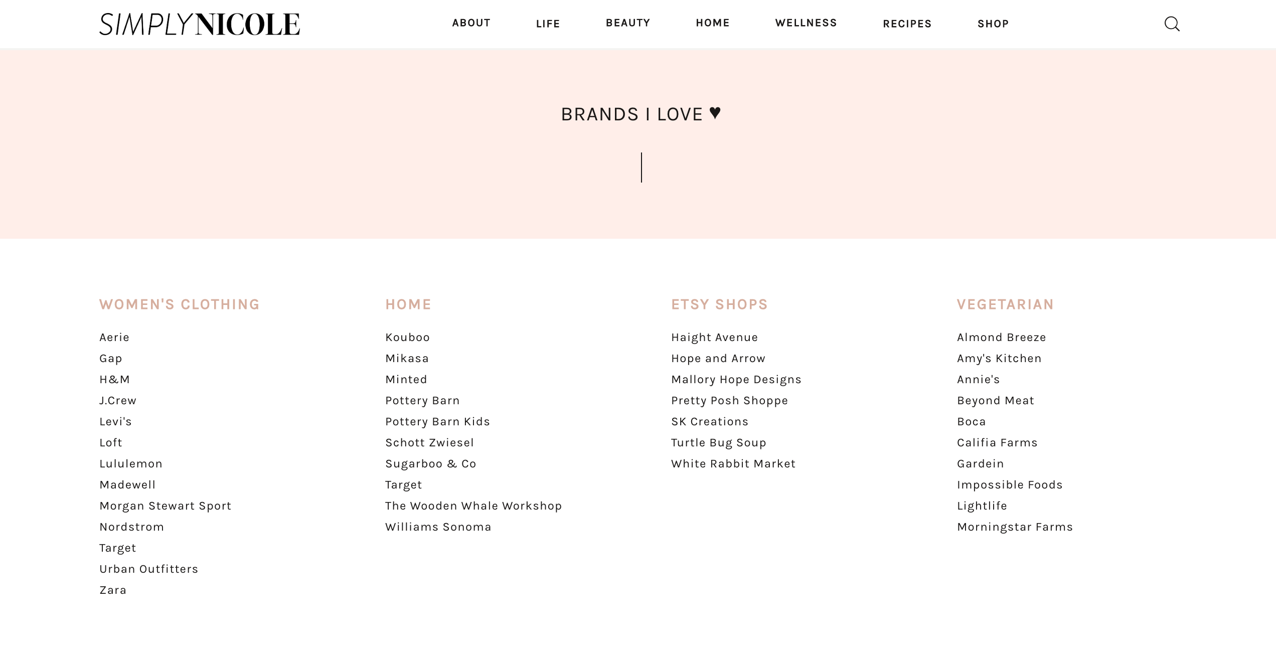
I added a Favorite Brands page with the companies I love supporting. I’ll be refreshing both pages often, so check back for new items. If there’s a product you ever need a link for, don’t hesitate to reach out via email or send me a DM on Instagram.
I’m also making it a focus to feature more small businesses. Whether it’s a new jewelry company, a precious children’s clothing brand, or a home decor Etsy shop, I’m dedicating space here to share these discoveries with you.
Navigation
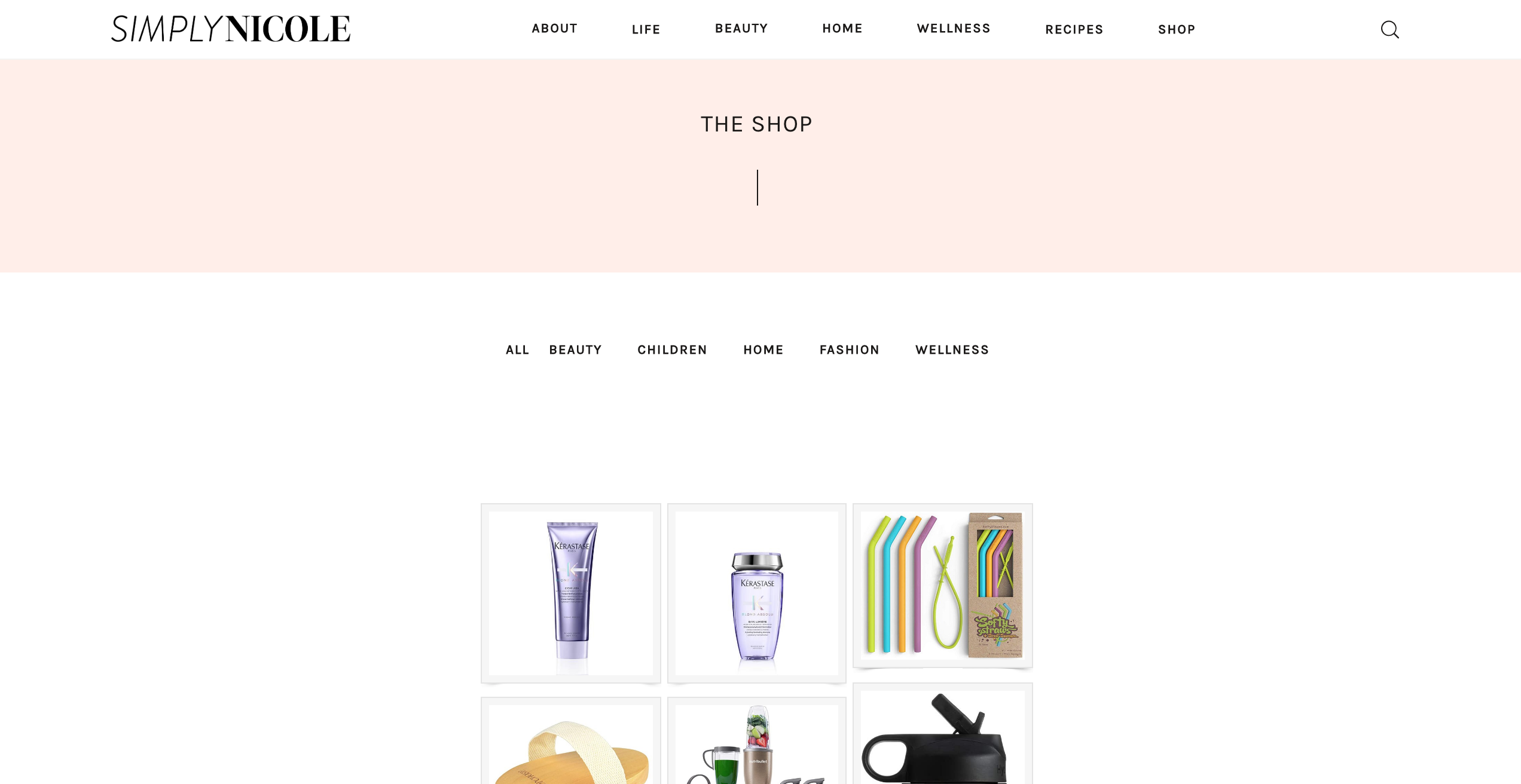
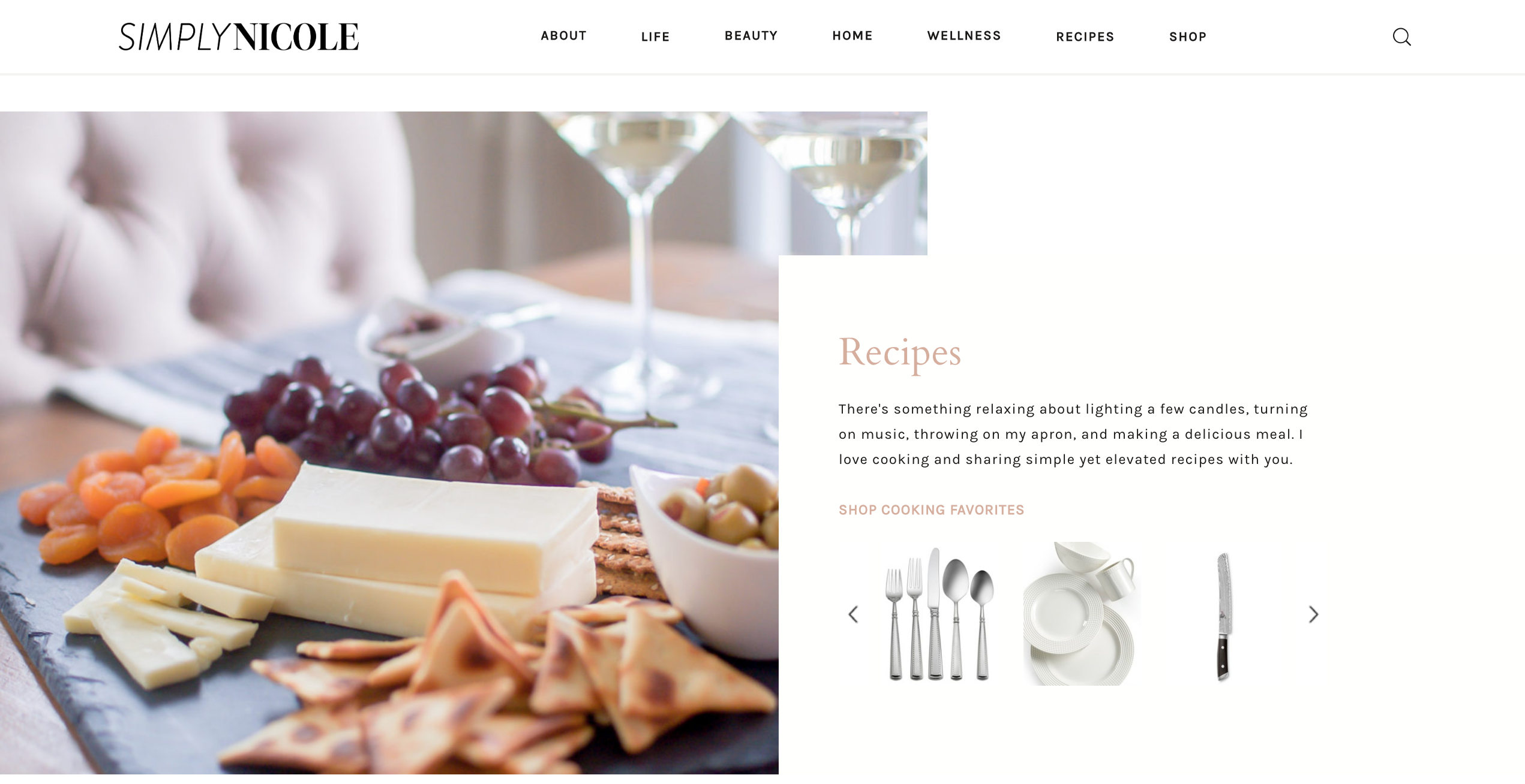
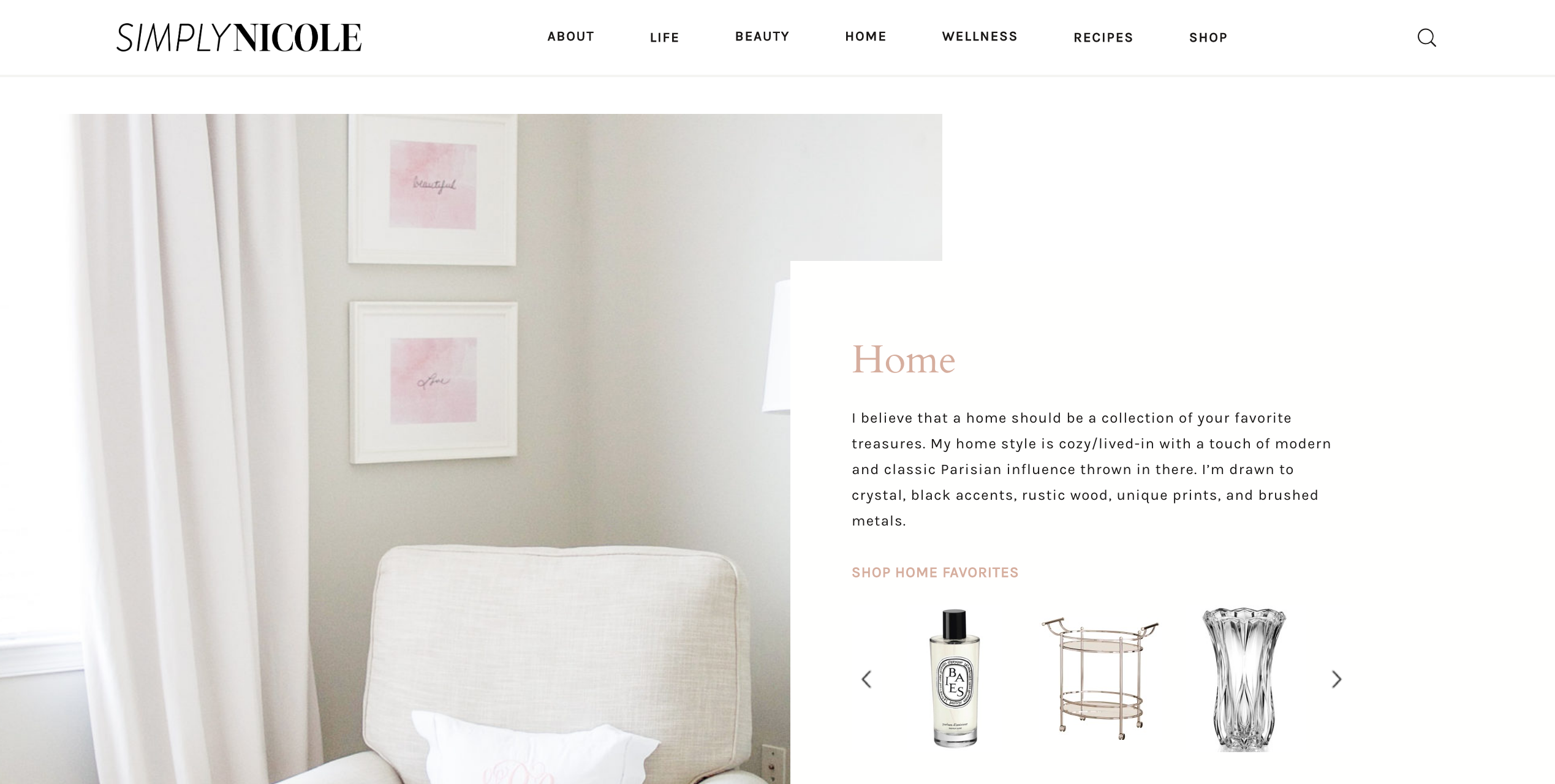
I also improved the top level navigation, with more category landing pages. Some of these were brought over from the old site, but others were created specifically from your searches. The goal is for you to find the posts you want to read, and help you find similar posts that you may not have known existed. Each landing page also features a small slideshow with my favorite products within that category.
Other New Features:
- FAQ and Fun Facts on my About page
- Newest blog post is at the very top of the homepage
- Reader Favorite Posts at the bottom of the homepage
- Enhanced search functionality
I did a lot of research to determine what aspects of the old site were most frequently visited. I did my best to make those pages and posts easier to navigate and find. My goal is to make continuous improvements to make it a pleasant experience. If you have any feedback, I’d love to hear from you. Please email nicole@nicoleraudonis.com. Thanks for reading and I hope you enjoy this new site as much as I do.
xo, Nicole


I love what you did! The little touches everywhere add such great energy and flow. You even have the favicon locked down 🙂
Congrats on all of this. I know how much work it is.
Thanks Andy! Huge undertaking, but I’m so happy with how it turned out.